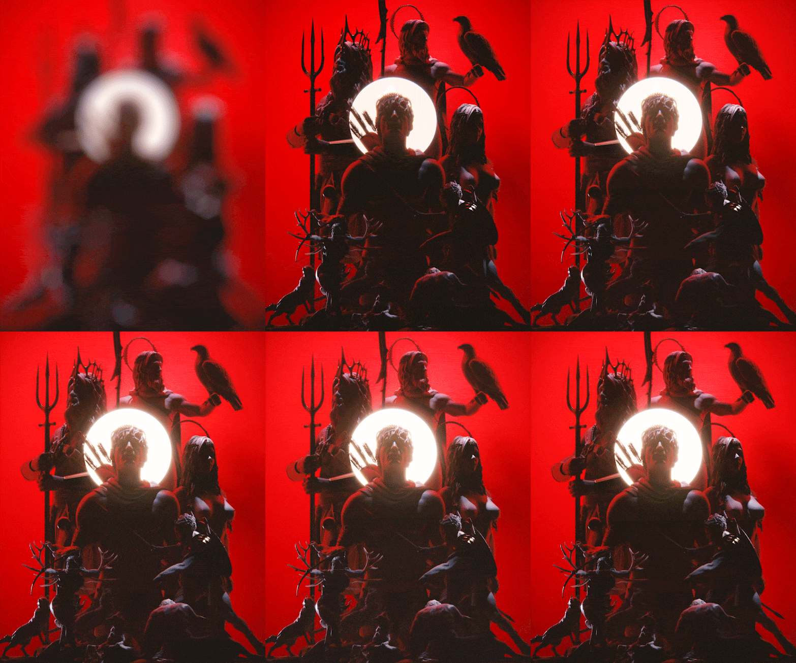
Welcome to the dark and grainy, retro, synth-based world of The Old Gods.
Set in an age of myth and heroes.
We set out to make full use of our multidisciplinary, cross-sector skillset at narrativ, allowing us to do everything from character design to a distinctive and tailored musical score and a full-blown marketing campaign, creating a proof of concept for a new IP.
The Old Gods

Since the very inception of this project there was always a vision of a moving companion piece to the character design and branding exercises. An introductory short film or sizzle reel to present this world and its characters to viewers.
Early on we decided to use an unusual aspect ratio, mainly driven by the fact that the majority of digital media is consumed through our phones and although we use computers and television to carry out our work or entertain ourselves respectively, we are never too far from our trusty little screens.
We settled on 4:5 as a final aspect ratio, allowing us to come up with interesting compositions and sequences taking full advantage of the chosen subject matter, myths and gods, which would greatly benefit from this as we are able to present them in a taller, larger than life format.
The final crucial decision we made was to score the music in-house specifically for the film, making the vision of this world uniquely our own.
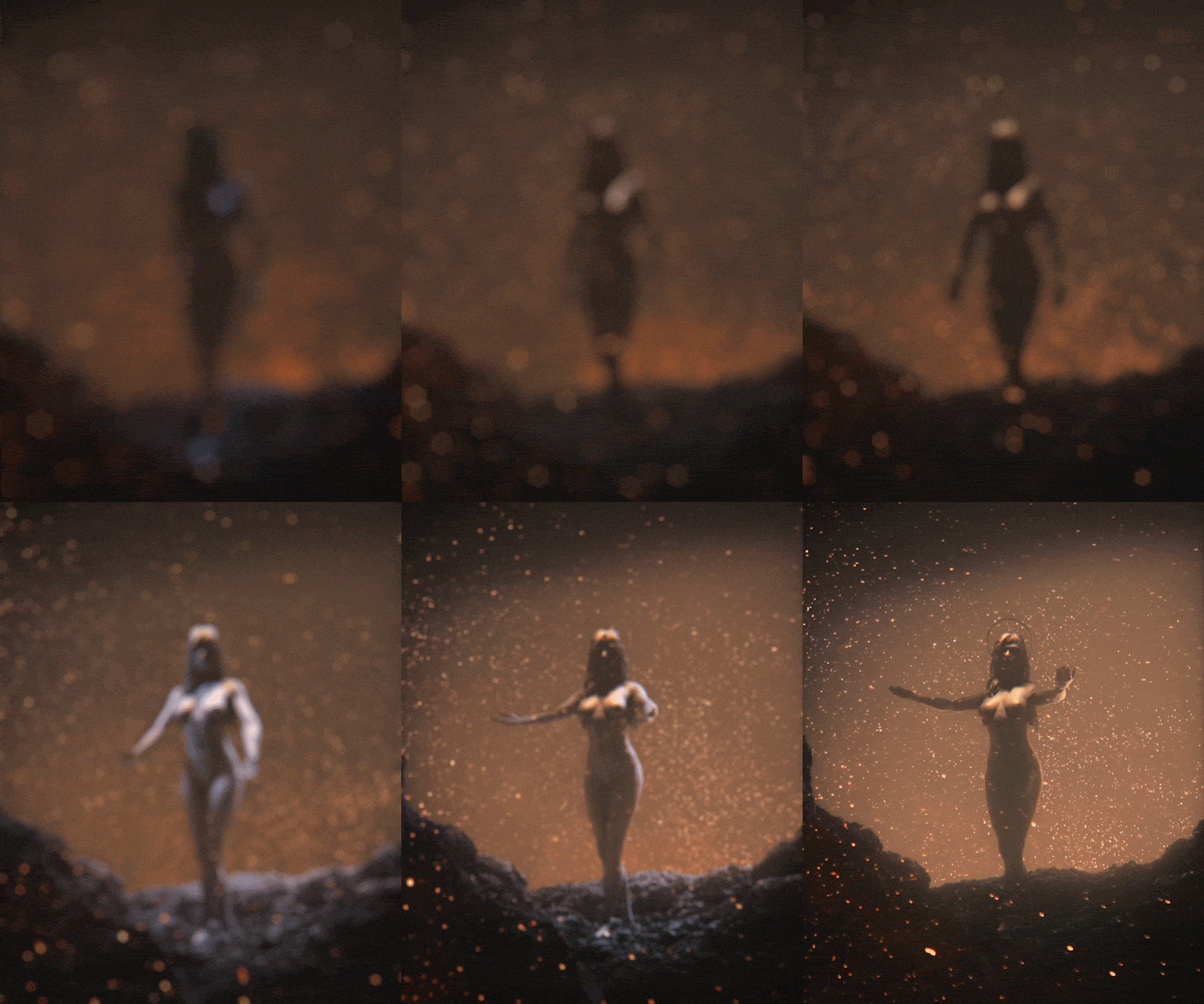

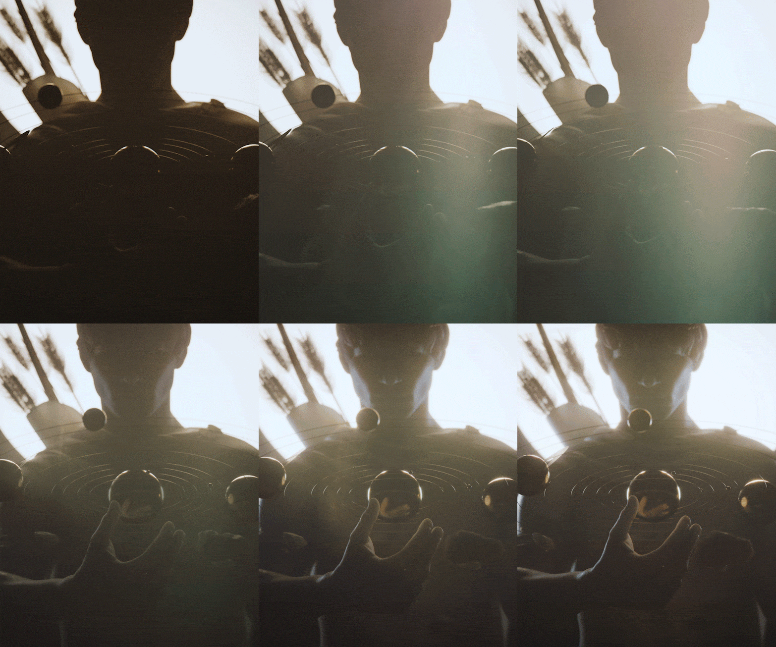


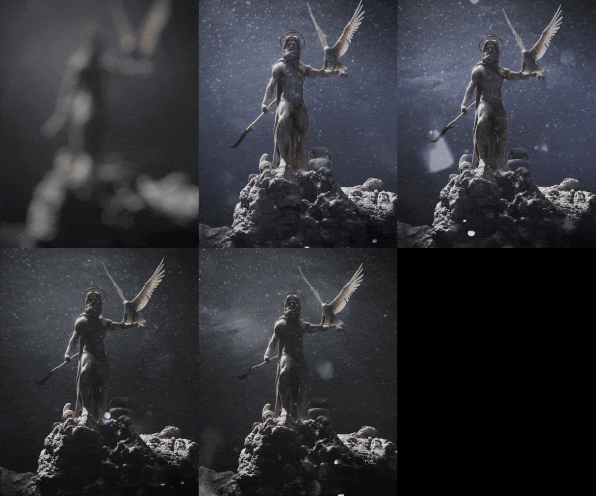

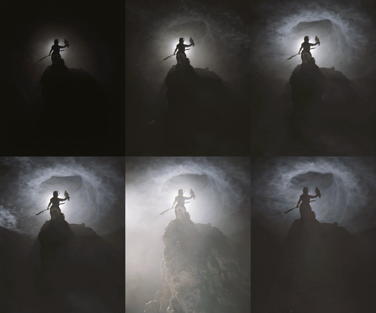
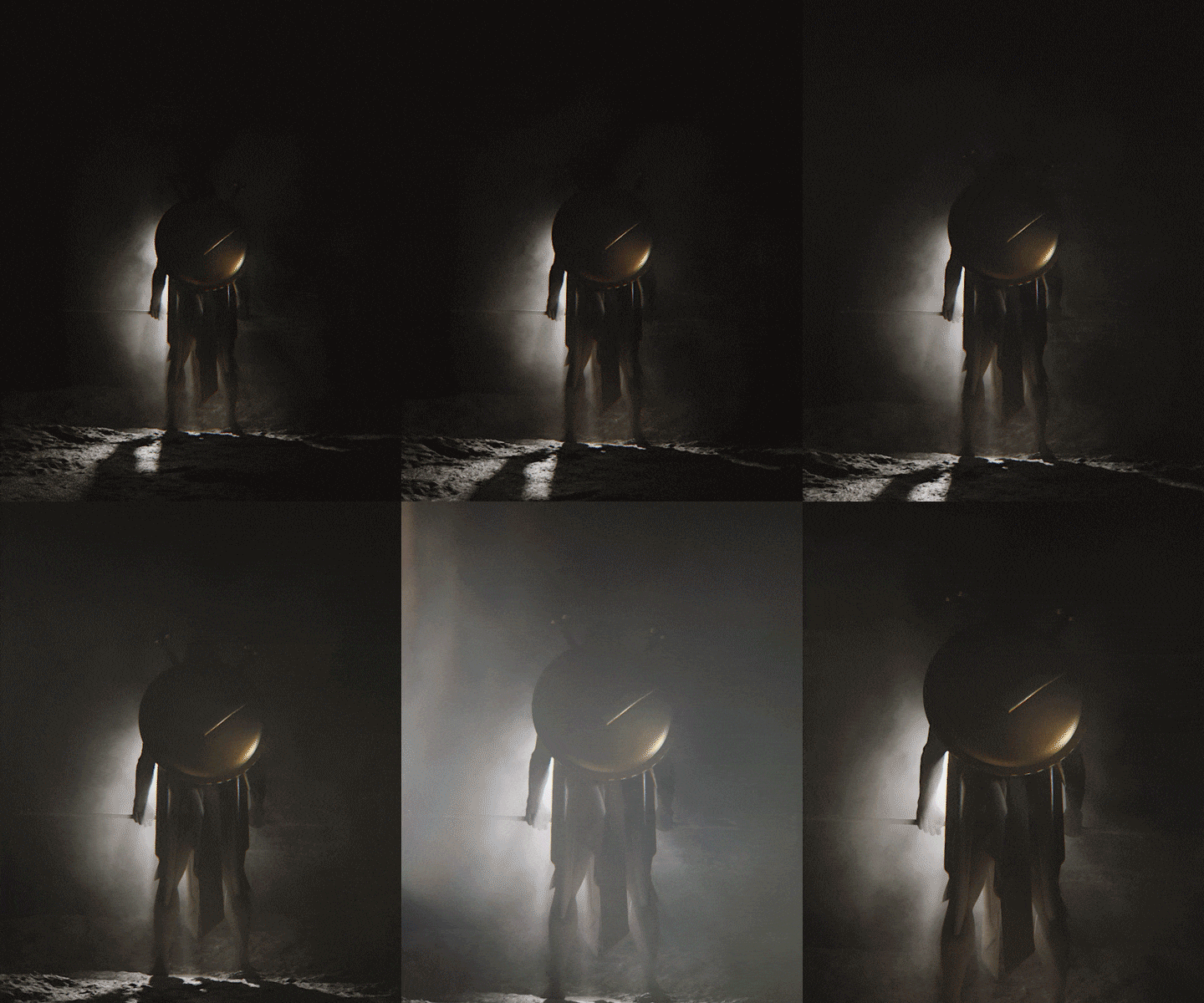
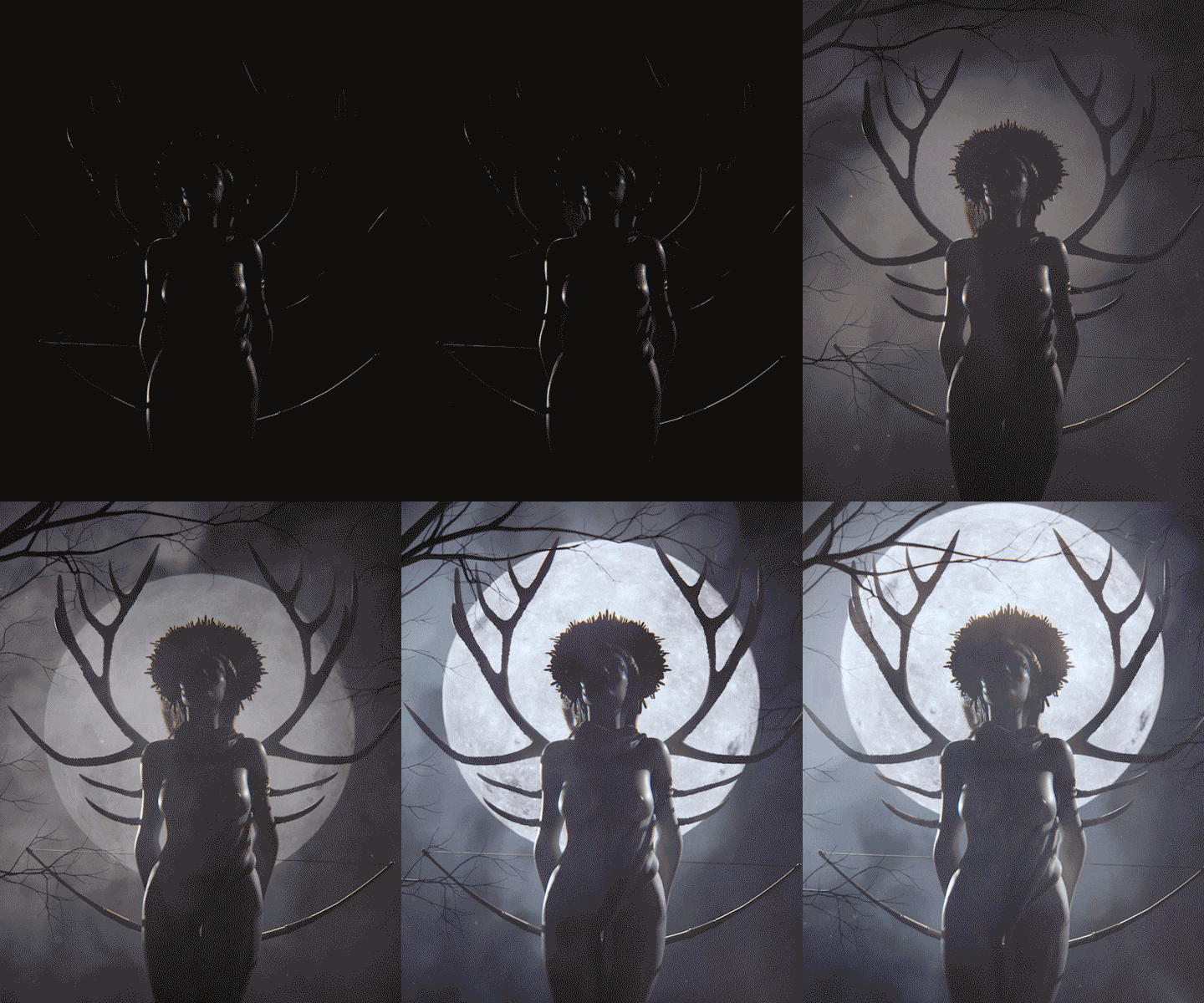
Once all characters were fully developed we began storyboarding our film.
Interestingly enough there was a very clear idea as to how to begin the film and introduce the viewers to the world of The Old Gods.

Once the world was introduced what followed was less clear but incredibly fun.
We carried out explorations to learn how to best introduce each god based on the their personalities and how to provide viewers with a satisfactory final "payoff" for each one, hopefully ending the film on a high and clearly celebrating both music and visuals.
Our final goal was twofold, providing us as creatives a solid storytelling foundation for further development in the future as well leaving viewers with a certain level of understanding of each god but peaking their curiosity and leaving them wanting more.

We scored the music in house so it was perfectly tailored to the film.
The music inspired the visuals as much as the visuals inspired the music. It was a wholly synchronous process all happening at the same time. The last melodies were being composed as the last pixels were being rendered.
We wanted the music to be synthy, dark, grainy and somewhat retro; we also wanted mysticism which we portrayed through the more melodic parts.


2020 was a year unlike any other for all. A unique situation where the majority of us were forced to live a lifestyle we were not prepared for, in a reality which seemed vaguely familiar through the non-fiction accounts in history books and fantastic fiction based stories told through multiple mediums.
In our case this new reality brought inspiration through introspection, a slower pace of life and as we adjusted to a new reality, a commodity a lot of us took for granted, time, was suddenly granted back to us to do as we pleased.
As creatives this fed a whole new area of our brains, where the old and the new collided. Small things like a new piece of music provided the spark of creation and a brand new world of ideas collided spectacularly with influences of myth and pop culture.
The idea for The Old Gods was originally born in March 2020 but it was temporarily left in the backburner to marinate and develop further until late 2021, when it was picked up again as we were exploring ideas for an original studio project.

3000 years of Western history and culture separate the two interpretations of Zeus below.
In the modern "Age of Marvel" we thought it would be incredibly fun and interesting to see where we would land, stylistically, given our exposure to the last 100 years of pop culture, music and cinema.

Challenge was simple, create 6 gods in 2 weeks.
The way we approached this was very much the way we approach any commercial project, by asking ourselves what is the biggest bang for our buck in terms of time savings we can make on doing menial work to allow us to fully focus on designing these characters?
The starting point for us was purchasing some very nice and very detailed Z Brush anatomy sculpts. We used a combination of bespoke modelling where required in addition to assets gathered from a whole slew of suppliers, creating an asset database and visual language for accessories, weapons and environments from places such as Megascans, Turbosquid, CG Trader, Marvelous Designer, Mixamo, Scan The World, among others.
Whatever moved the story forward was allowed.
Art direction was always the primary focus, technical second. Every scene was approached like a set design, if it looked good it got the rubber seal of approval.


The scope of our experimentation also extended into the world of branding.
It was very important for us to create something beefy, bold, graphic and memorable, perhaps even a little oppressive and iconic in it's own right.
An identity that would feel comfortable in the epic world of myth but taking into account more modern graphic design sensibilities.
Remember the "Age of Marvel"? Yup... so did we, clearly.
CGI still study of logo "battle damage" progression.
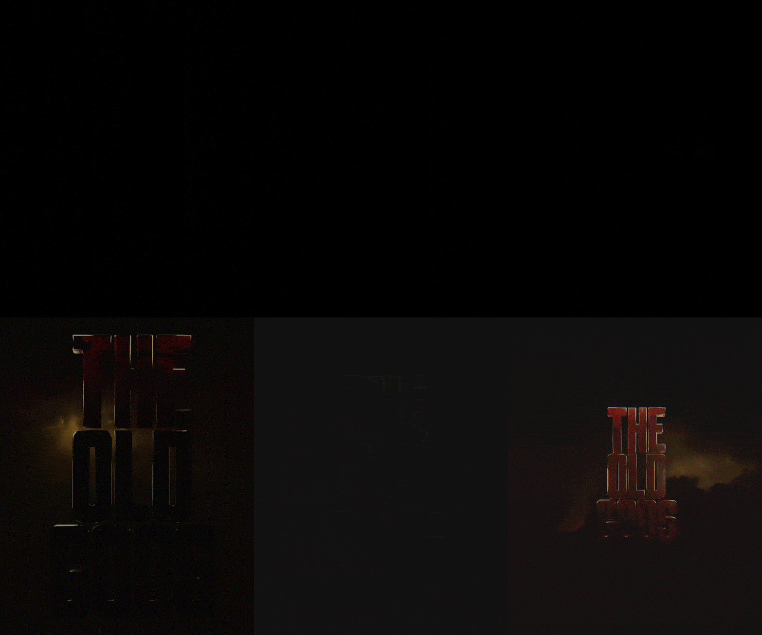
Title sequence animation development studies until we landed on our chosen, more graphic option.


Pretty simple, we're making a film. We NEED a poster and as enthusiasts of cinema this is one of the more iconic and widespread aspects of this medium.
Everyone has at least one favorite poster that nostalgically reminds them of times gone by.
So if we are going to dabble into this aspect we went straight to the king of the medium, Drew Struzan and had the unenviable task of breaking down and studying some of his most iconic work.


